GIS Class Session Guide: 7 FEB 2017
Session Learning Goals
By the end of this class session, students should be able to:
- Speak fluently about the value of designing a map with a specific audience and story to share that "you own."
- Demonstrate the concept of "figure" and "background" by applying symbology to map layers appropriate to the intended use of the geospatial image.
- Competently navigate ArcMap to apply labels, choose a symbolic representation of qualitative and quantitative data, and create appropriate symbol schemas for a given application.
- Navigate a file geodatabase to access appropriate map making resources.
Learning Exercise 1: What are the stories behind the maps?
A map is an image--a visual representation of the world--much like a photograph. Most folks would accept that an that image, while seemingly objective in its capturing of a particular frame, is actually a product of specific choices made by the photographer. Maps are similar and may, in fact, contain much more value-laden elements than a photograph precisely because each visual element of a map can be adjusted by the map maker.
The two maps presented below both attempt to condense an incredible amount of quantitative information about our social world and present it visually. The authors of the map are different, and the interface of the map frame itself is also different. You may click the screen shot of each map to view the hosting site.
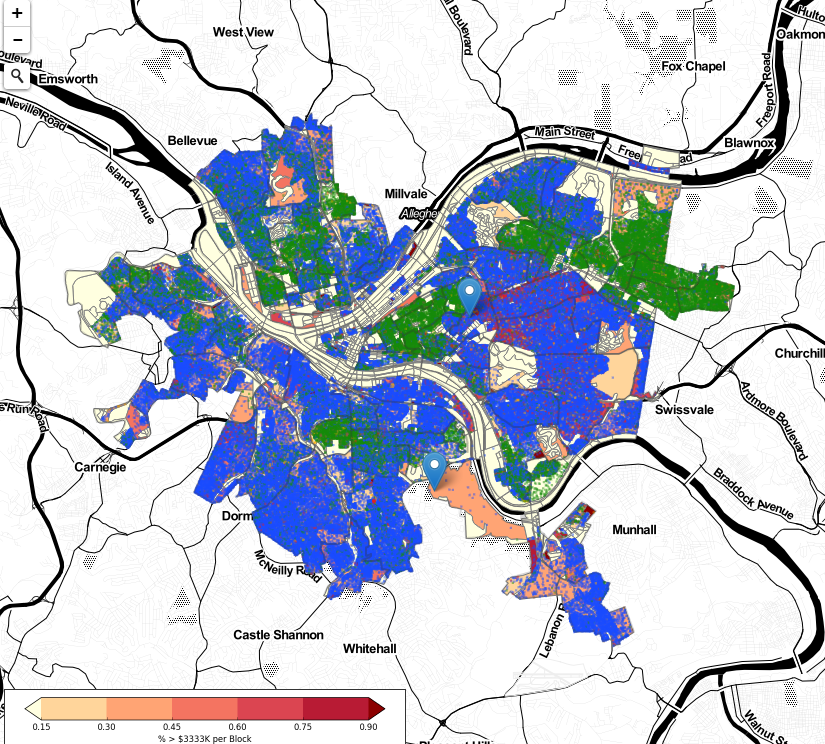
This "dot map" was created by the CMU Create Lab for use by K-12 teachers who work with students on topics related to data fluency |
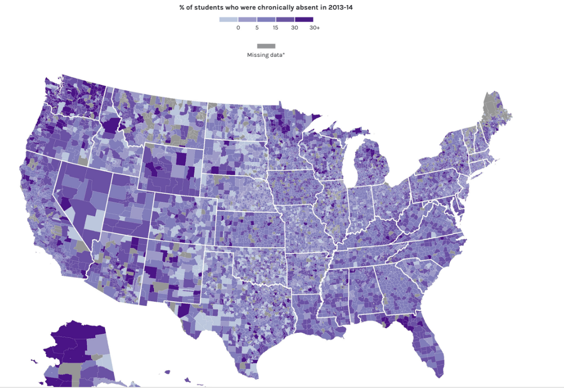
This static map of the USA was created as part of the US Department of Education's special online report concerning absenteeism in K-12 schools across the country. |
Consider one or more of these questions after studying these maps:
- What clues do we have concerning the intended audience for each map? What message might the creator's of each map be attempting to convey to their intended audience?
- Both of these maps visualize data that reveals aspects of our society that are complicated and extremely personal in nature: race, income levels, and the experience of students not attending school. To what degree do you feel as if the authors of each map are showing care and respect for the complicated nature of these issues?
- Step back and think about how each map looks and "feels". What design strategies were used which enhanced the map's value? Which aspects of the map designs detracted from your experience reading the maps?
- What lessons can we extract from comparing these maps about how we could create maps about issues of social importance?
Learning Exercise 2: Work through ArcMap basics
Let's learn the basic functionality of the ArcMap software--these skills are the core skills covered in Kurland and Gorr chapter 1. Start by importing layers from the Data directory >> nyc.gdb >> ManhattanTracts
- navigating a map
- Measuring tool: lines, polygons, polylines
- Feature attributes
- Selecting features
- Changing selecting options
- Column statistics
- Labeling and converting labels
Principles of great map symbology
The art of creating a map enters in when we consider that a map tool only does what we tell it to do, and we must decide what to attempt to convey in a map and how to do so most effectively. When making design decisions, consider these principles
- Think about maps as consisting of "features" and "ground" -- meaning elements of the map that we are drawing attention to (features) and the elements that give context to those features (ground). Since human brains are limited in the information they can take in, be selective in the features you focus on and ground elements to give context. resist the urge to over-feature your maps.
- Simple and less busy is better, in general, than more data. This is true for all but the most primed audiences. For example, when discussing land zoning with zoning professionals, these individuals can probably cope with more information in a map than a lay audience at, say, a zoning hearing committee where the audience doesn't have expertise in zoning.
- Use colors to draw out the features and push the ground into the background. Resist the urge to use "cool" colors that you enjoy because you may be too familiar with the map's data. You may have a tendency to over-color.
Learning Exercise 3: Symbolizing Maps
Now that we can navigate the software and interact with the features, we are ready to begin creating a map that conveys specific information about a place. Let's work through the skills in Chapter 2 tutorials of the Kurland and Gorr book
- Create point and polygon maps with symbology applied to each
- Use unique symbols for each of the qualitative data types
- Create and execute a definition query for display of a subset of features in a layer
- Displaying points as unique features
- Displaying dense lines (streets) using appropriate symbology
- Graduated point maps (USA city population)
- Creating custom classes for a symbol layer
- Custom coloring
- Nornmalizing values on a map using an aggregate field (population and area)
- Normalizing area figures and symbolizing
- Creating a dot density map and symmbolizing appropriately